Forms
ReadyOp forms allow you or any of your users with administrative rights to create and design your own electronic forms for surveys, reporting, etc. A form can be designed for one time use (such as an election ballot, event registration, event feedback) or can be used on an ongoing basis (such as “See something, say something,” incident report, daily/weekly status reports).
Recipients can be anyone in the Roster – they do not need to have User credentials. The forms can be completed and sent securely from a user’s laptop or smartphone.
Creating or Modifying a Form
- Start by selecting the “Forms” tab at the top of the ReadyOp dashboard.
- This tab may not be present if you have not been granted access to manage the forms.
- After a form has been saved and published, it can be accessed directly from the Forms tab.
- A link to the form can be emailed to a single or group of recipients for their one time or ongoing use.
- Once you’re in the forms tab the window will be divided into two sections.
- On the left side of the window will be a list of any already created/existing forms, as well as an an action toolbar above the list.
- The right hand side will show the form preview window, when you initially load the forms tab this side should be empty/blank.
- To create a new form, click the “Actions” button in the left side toolbar and continue by selecting “New Form”, then continue to step 5.
- To modify an existing form, find the already existing form in the list of available forms an double click on the entry. Note: You cannot modify a form once it has been published.
- The left side of the forms tab (that previously showed a list of existing forms) will be replaced with buttons for each type of element you can add to your form.
Configuring a form’s settings
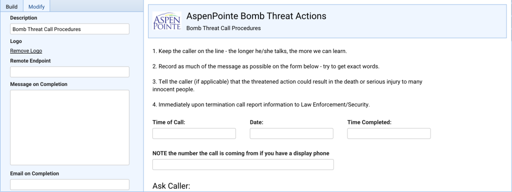
Before you begin adding fields to your form, you’ll want to give your form a title. You may also want to change the logo that appears in the top left of the form, or add a description or other instructions to the top of the form/heading.
To configure a form’s settings:
- In the right half of the window, you should see a preview of your new/existing form. Left click on the forms heading to bring up the configuration options for the form itself.
- After clicking the form heading the left side of the Forms window should change to now have the following configuration options;
- Form Name
- The name you would like to give to the form, this is also the bold heading displayed at the top of the form.
- Description
- A brief description of the form, or form instructions. The description is displayed below the form name/heading and logo.
- Logo
- If you’d like to use your organizations logo or a custom image to display in the top left of the form with the form name/heading you can upload it here.
- Email on Completion
- When configured, when a user completes a new form entry, a notification e-mail will automatically be sent to the e-mail or (comma separated) e-mail addresses provided. The notification e-mail will include the name of the form and a PDF copy of the submitted form entry.
- Form Name
Adding a form element
On the left side of the forms tab you should have several different element choices you can chose from to add to your form. If you don’t see this window, ensure you are on the “Build” sub tab.
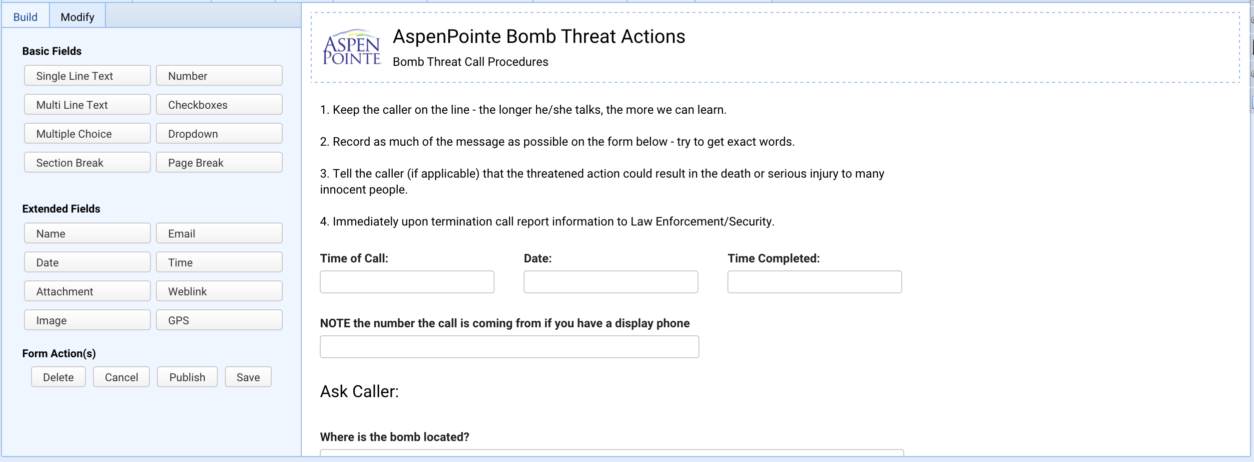
To add a field to the form, click the corresponding button for that element in the build tab. The following is a list of the available field types and their configuration options.
- Single Line Text
- A single-line text field can accommodate just a few words in a single line of text, such as a name, phone number or brief description.
- Configuration options specific to this field:
- Range (min and max character length)
- You can specify a required minimum or maximum (min-max) number of characters a user can type into the field. For example, if the range were 100 (min) to 500 (max) a user would not be able to input less than 100 characters or more than 500 characters.
- Range (min and max character length)
- Multi Line Text
- This option to provide a text field that allows for long comments or descriptions that can span several lines.
- Configuration options specific to this field:
- Range (min and max character length)
- You can specify a required minimum or maximum (min-max) number of characters a user can type into the field. For example, if the range were 100 (min) to 500 (max) a user would not be able to input less than 100 characters or more than 500 characters.
- Range (min and max character length)
- Multiple Choice
- Closed-ended field type where people can select only one answer from a list of choices.
- Configuration options specific to this field:
- Choices
- This is where you can define the options/choices users are able to select from when filling out this field. You can use the radio/checkbox next to the text input/choice that you would like to have selected by default.
- Arrangement
- One Column
- Choices will be arranged in a single column with each choice on a new line by itself.
- Two Column
- Choices will be arranged into three horizontal columns from left to right.
- Three Column
- Choices will be arranged into three horizontal columns from left to right.
- Side by Side
- Choices will be listed inline with each other, spanning a new line when necessary.
- One Column
- Choices
- Section Break
- A section break allows you add paragraphs of text to your form. This field type doesn’t collect any data, but it allows you to add headings and descriptive text anywhere in a form to provide more context or to break a form in to sections.
- Configuration options specific to this field:
- Description
- The text or instructions you’d like to appear in the section break. This can be a single line, or span several lines/paragraphs.
- Description
- Number
- The number field restricts user input to numbers only.
- Configuration options specific to this field:
- Range (min and max value)
- You can specify a limited range of values (min-max) a user can type in the field. For example, if the range were 100 (min) to 500 (max) a user would not be able to enter any value less than 100 or greater than 500.
- Range (min and max value)
- Checkboxes
- Checkboxes give users the ability to select from a set of options. Similar to the Multiple Choice field, however, users may select more than one option.
- Configuration options specific to this field:
- Choices
- This is where you can define the options/choices users are able to select from when filling out this field. You can use the checkbox next to each text input to specify whether the option is checked, or unchecked, by default.
- Choices
- Dropdown
- A dropdown allows the user to choose one option from a specified list. When a drop-down list is inactive, it displays a single (selected) value. When activated, it displays (drops down) a list of values, from which the user may select one.
- Configuration options specific to this field:
- Choices
- This is where you can define the options/choices users are able to select from when filling out this field. You can use the radio/checkbox next to the text input/choice that you would like to have selected by default.
- Choices
- Page Break
- A page break controls the form layout by allowing you to break the form into several pages. This does not affect how users fill out a form using ReadyOp, however, when exporting a form to a PDF or printing a form, anywhere there is a page break will be separated into a new page in the printout/PDF.
- Name
- Similar to a text field except it allows you to gather a person’s name in a single field.
- Configuration options specific to this field:
- Name Format
- Basic
- The field will ask for only a First and Last name.
- Extended
- The field will ask for Title, First, Middle, Last, and Suffix
- Basic
- Name Format
- When exporting submitted forms to Excel, name fields will be displayed together in a single column.
- Email
- Similar to a text field except it allows you to gather a user’s e-mail address. This field will not allow a user to input a value that is not a properly formatted e-mail address.
- Date
- The date field allows users to input a date and additionally provides them with a date selection picker.
- Configuration options specific to this field:
- Date Format
- MM/DD/YYYY
- The field will prompt users to enter in the date as the two digit month, followed by the two digit day and lastly the 4 digit year.
- DD/MM/YYY
- The field will prompt users to enter in the date as the two digit day, followed by the two digit month and lastly the 4 digit year.
- MM/DD/YYYY
- Date Format
- Time
- The time field allows users to input a time and additionally provides them with a time selection picker.
- Configuration options specific to this field:
- Time Format
- HH:MM AA
- The field will prompt users to enter in the time using two digits for the hours, and 2 digits for the minutes. It will also provide a dropdown to specify either AM or PM.
- DD/MM/YYY
- The field will prompt users to enter in the time using two digits for the hours, 2 digits for the minutes, and lastly 2 digits for the seconds. It will also provide a dropdown to specify either AM or PM.
- HH:MM AA
- Time Format
- Attachment
- This field allows you to request that users upload a file/document/image when they are filling out a form.
- Configuration options specific to this field:
- Range (min and max value)
- You can specify a limited range of file sizes (min-max) a user can type in the field. For example, if the range were 1 (min) to 5 (max) a user would not be able to upload any files less than 1MB or larger than 5 MB.
- Accept File Types
- You can use this option to limit users to only allow specific types of files to be uploaded. You can specify either the file extension(s) or file mime type(s).
- For example, to only allow GIF, JPEG and PNG images to be uploaded you could specify either ‘gif, png, jpg, jpeg’ or ‘image/gif, image/png, image/jpeg’
- To allow a file of any type to be uploaded, simply use a asterisk option ‘*’
- Range (min and max value)
- Weblink
- A weblink field allows you to provide a clickable link to an external resource for users filling out your form. This field does not collect any data.
- Configuration options specific to this field:
- Weblink
- The URL to the external resource you’d like to provide to users filling out the form.
- Weblink
- Image
- Allows you to upload an image that will be embedded directly into the form itself. Users will see this image directly on form itself, this field does not collect any data from users.
- Configuration options specific to this field:
- Image
- Use this file input field to upload the image you’d like to appear in your form. You can only upload GIF, PNG, or JPEG images.
- Image
- GPS
- This field will provide a button labeled “Get Position”. When users are filling out your form they can hit this button to log their current physical GPS coordinates (both latitude and longitude).
Common configuration options
The following is a list of configuration options that are common to multiple different field types.
- Field Label
- A descriptive text/label displayed in bold above a given field/element.
- Grid Size
- This is the amount of horizontal space this form element should occupy. An element with a grid size of 1 will take up one third of the forms width, grid size of 2 will occupy two thirds of horizontal space. Lastly, a grid size of 3 will span the entire form horizontally.
- If the field also has a Field Size parameter, the grid size cannot be smaller than the field size’s width.
- Validation
- If set to Optional, this field will not be required to be filled out when submitting a form. If set to required, users who are filling out this form will not be able to submit the form if this field is left blank.
- Indexed
- Whether or not this field’s values should be searchable when browsing submitted form entries.
- Field Size
- For dropdowns, text fields, etc. This allows you to specify the width of the input field itself.
Sending a Form
- After you’ve selected the person(s) you’d like to contact and have the communicate dialog open. Select the “Send Form” option from the communication type picker in the communicate dialog.
- After selecting the “Send Form” option in the communication type picker and pressing “Continue” you’ll be prompted with the “Send Form” dialog.
- Inside this new dialog it’s possible to continue adding more contacts to send the form. You can click and drag contacts in the following locations into this dialog;
- The Search -> Tasks/Assets dialog.
- From inside a “Manage Object” dialog.
- You can drag objects themselves to add their occupants to the list.
- From the roster.
- At this point it is necessary to select the form you’d like to send by clicking the “Select Form” button.
- Once you’ve selected the form, continue by pressing “Select Form” and a Send Form dialog will appear.
- Inside this dialog you’ll need to type a descriptive email subject for the form.
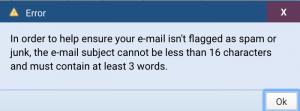 The email subject cannot be less than 16 characters and must contain at least three words. An error will be displayed if these requirements are not followed.
- In the top right corner of the send form dialog you’ll have to specify the date on which the form will expire.
- You can arrange for a form to be expired in a week, month(s) or year(s) from the date the form was created.
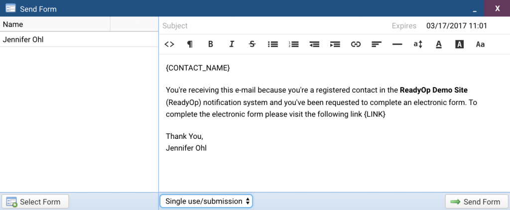 Also in the send form dialog, you’ll have two options to choose from;
- Single use/submission
- A recipient can only fill out the form once.
- Multiple use/submissions
- There are no limits to the numbers of times recipients can fill out the form.
- Single use/submission
- When you’re ready to send the form, press the “Send Form” button in the bottom right corner and you’ll be prompted with the following dialog;
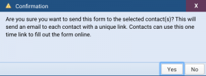
- Press “Yes” if you would like to send the form and press “No” to cancel.
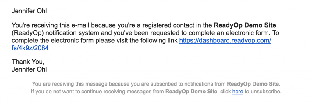
- After the form was sent the recipients will receive an email with a message from ReadyOp as the one shown below.
- In order to ensure you’ll keep receiving emails from the ReadyOp system in the future, don’t click the unsubscribe button located at the bottom of the message.
Making an Icon on a mobile device
Before adding the Icon to your mobile device. You will need to send the form to your phone via e-mail through ReadyOp. See Sending a Form in the previous section for instructions on how to send a form, be sure to select the Multiple use/submissions option when sending the form.
Adding an icon to an Android device
Once the form has been received in an email on your device:
- Click the link to open the form
- Tap on the three vertical dots in the top right hand corner of your screen
- Select the “Add to Home Screen” option
- When prompted, give the new icon a meaningful name
- Press “Add” and it will then appear on your device with your other application icons
Adding an icon to an iOS device
Once the form has been received in an email on your device:
- Click the link to open the form
- Tap the center icon at the bottom of your screen (a box with an up arrow)
- Scroll through the new options menu by swiping the icons to the left or right
- Select the “Add to Home Screen” option
- When prompted, give the new icon a meaningful name
- Press “Add” and it will then appear on your device with your other application icons

